
White Chip Insurance
- Lead Generation site for Auto & Health Insurance
- Hyperlocal Programming & Phone-Numbers
- Multi-step form with real-time lead importing
- Personalized design for site & social medias
- Trustpilot Review System Implementation
- PPC Google Ads Campaigns

Company Overview
White Chip Insurance (a division of Star Nsurance) bread and butter has always going for the phrase: Cheap Car Insurance Florida.
What we did was expand the reach of the website. So it’s not just an insurance agency based in Tampa, Florida. Following his immense success with other insurance lead-generation sites, the client was looking for a clean, professional design for this new company.
White Chip Insurance offers the Cheapest Car Insurance Rates in Florida, and plans to expand offerings to all 50 states soon. White Chip Insurance also bundles free health insurance policies with their affordable car insurance quotes.
What We Did
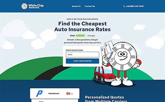
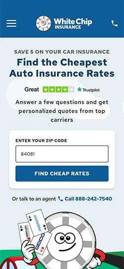
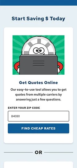
GoldenComm personalized White Chip Insurance for the client with the poker-chip theme. We created a multi-step form for ease of use in requesting a quote and integrated a lead spreadsheet that auto-populates with information from the form for White Chip’s insurance agents to leverage.
We utilized hyperlocal phone numbers to target the various Florida regions. Goldencomm additionally built out a PPC Google Ads campaign to drive qualified leads to White Chip’s insurance agents.


